X

Building a financial dashboard in Power BI

No more manual reporting. Getting instant insights into business with modern analytics.

Use the skills you already have

Any company needs to keep an eye on how well it is doing. This is called performance monitoring. No matter how big or small the company is or what business model it uses, monitoring performance helps leaders figure out how well the company is doing and what they can do to make it more efficient and profitable.

Transactional data alone does not provide a quick view of business performance. To fix this, analysts aggregate the data to find metrics that show how well results relate to defined business objectives. Once such Key Performance Indicators (KPIs) are calculated, data visualization comes into play to make numbers easier to understand so that managers can make decisions quickly and with all the information they need.

Often such an analysis is conducted in Excel, exporting the transactional data from the accounting systems. Excel is a very versatile tool and has established itself de facto as a standard for ad-hoc analyses. Nevertheless, it needs some innovative functionalities of modern BI solutions, one for all, visual drill-down, and drill-through. Furthermore, Excel sharing capabilities are far from modern BI. Although it is now possible to share workbooks via Microsoft SharePoint or OneDrive to create shared workspaces, software like Power BI or Tableau improves collaboration through data sharing and role differentiation.

Power BI makes switching from Excel to more advanced BI tools easier. Power BI and Excel can be used together to get more work done. Power BI has modern features based on core concepts that Excel power users already know.

Quickstart in self-service analytics with Power BI
This article presents how managers can leverage Power BI to monitor the financial performance of their businesses. As proof of concept, a case study will be presented in which transactional data will be fed into Power BI and aggregated into KPIs like Net Profit Margin, EBITDA, Berry Ratio, etc., to estimate a company’s profitability. Finally, those indicators will be benchmarked against target values to evaluate performance.

The case study will demonstrate Power BI functionalities and show how Excel user can leverage their know-how to adopt advanced analytics. It is worth mentioning that this presentation uses only the free version of Power BI Desktop. This tool version provides the complete user experience and allows importing, modeling, manipulating, and visualizing data. The sharing capabilities are always guaranteed via the Web App, which comes with a discrete subset of the desktop features.

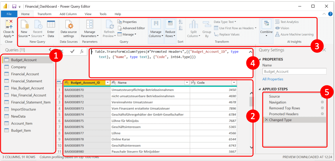
Automatically load data
and get started analyzing!

Similarly to Excel, Power BI data ingestion leverages Power Query. This enables users to pull data from several sources, including Excel workbooks, SQL databases, text files, etc., through a combination of point-and-click action and M language statements.Following Microsoft documentation, Power Query M formula language is a case-sensitive functional language similar to F# used for data mashup. In the figure below, it is possible to see an example of the Power Query Editor window.
PowerBI Query Editor
The data used in this case study has been stored on SharePoint in Excel format. The tables listed in the pane Queries (1) are imported by ingesting one or more Excel workbooks containing transactional data for a given period and a workbook containing master data and relational data, such as the company information and the mappings between bookkeeping accounts and the corresponding item in the income statement. Exploiting Power Query, Power BI automatically loads the data every time a new file is added to SharePoint and appends the records to the corresponding table. The Power Query UI (2) shows a preview of the data that is going to be imported. Furthermore, it is possible to apply transformations such as filtering, renaming attributes, defining datatype, rearranging columns, etc. Advanced transformations available in the Transform tab of the ribbon (3) can also be applied. Finally, it is possible to specify complex transformations in M language directly in the formula bar (4). The syntax is the same as the Excel Power Query editor, so Excel users can leverage their know-how. All the transformations applied are tracked in the Applied Steps pane (5), in which it is possible to remove unnecessary intermediate steps and spot errors during the loading phase.

Data Modelling
Why, What, and How

While Excel allows defining relations among tables, Power BI allows graphical interaction with entities in the logical data model to define and customize relationships. The figure below shows the data model created for our case study.

Power BI can also infer relationships and their cardinalities automatically. Unlike other database management systems, relationships in Power BI are defined with a cross-filter direction. A relationship between two tables defines how Power BI filters the data when relating the two entities. Let’s consider the relationship between Company and Financial_Statement in our case study. The direction of the relationship is from Company to Financial_Statement. It means any column from Company can filter the data in the Financial_Statement. The opposite is not valid. It is possible to specify the direction that filters will propagate. The available options depend on the cardinality type.

Power BI allows users to visualize the data model, facilitating the development. Relationships are autodetected based on the labels of the features, and data type and cardinalities are auto-set based on the first 100 observations. Whenever automatic relationships fail, they can be set manually or modified in a dedicated window, in which it is possible to define foreign keys, cardinalities, and the direction of the cross-filters.

PowerBI Data Model Window

The most efficient way to prepare your data for Power BI

Once the data model is defined, Power BI can perform calculations, define new features, and create new tables from the “Data” window, in which DAX language can be used to apply formulas and functions. A reasonable question would be: why perform calculations in a different window when I can do it directly in the Power Query Editor? The short answer is: that it is a matter of efficiency. Indeed, many calculations that can be performed in the Data window can also be carried out in the Power Query Editor. However, while the Power Query Editor reimports all the data every time something is modified, modifications on the Data window are applied to imported data. This makes data preparation much more efficient, especially with extensive data.

Build professional dashboards
without any coding skills

Finally, the data is ready for our dashboard. Power BI enables the user to combine all the visualizations required in an interactive report. To achieve this, Power BI comes with a canvas. The Report window is organized into tabs resembling an Excel workbook, although their function differs. In Excel, calculations and visualizations are performed in the same place. A worksheet can contain cells in which intermediate analyses are performed, results, and visuals. Such a structure could be more optimal, especially regarding reporting. Therefore, in Power BI, calculations and visuals are strictly separated. The former is performed in the Data window and is available throughout, while the latter is built and managed only in the Report window.

That can be easily created by dragging the desired visualizations from the right pane into the canvas. The data feeding the visualizations are then dragged directly from the Fields pane on the far right. The rich set of standard visuals can be extended with paying and free add-ins in the Microsoft marketplace. Furthermore, suppose none of the visuals, from both the standard visuals and the marketplace, is satisfactory. In that case, new representations can be programmed directly into Power BI using R or Python, allowing even greater flexibility.

The result is presented below. It is an interactive report that integrates various visualizations, and it can be shared across the organization or even published on the web.

Do you want to see the interactive result of
this exercise here live in action?
By registering for our newsletter, you will receive monthly updates about our articles, products, and services.
Power BI Live Dashboard

Conclusion

To summarize, Excel and Power BI share some characteristics. More precisely, the data import facility and the best practices connected with it are the same. Using Power Query ensures that import from several data sources/formats is possible. In addition, Power BI provides a fully-fledged set of functionalities for data modeling thanks to the user-friendly user interface. Coming to calculation and visualization, Power BI separates the two things by default and ultimately allows excellent flexibility by being better integrated with more advanced tools such as Python and R. Finally, Pro/Premium licenses grant sharing capabilities. Finally, data can be exported into Excel to perform advanced ad hoc analyses.

As shown in our previous article, the BI tools market is increasing steadily due to a large amount of data available and the necessity to use its insights to make competitive decisions. Power BI provides a modern toolkit allowing non-technical users to exploit advanced analytical functionalities. Through its similarities with Excel, Power BI grants a smooth transition towards modern Analytics tools and will enable users to transfer all of their current Excel know-how.

HOW WE CAN HELP YOU FURTHER

Related Services

The data services we offer are comprehensive in nature and cover a wide scope, however, as an elementary introduction, you can rely on us to provide the following solutions.

Data Analysis

We organize and examine data to create actionable intelligence.

Dashboard Design

The creation of visualization tools that allow data to be assessed efficiently and effectively.

Data Governance

We implement architectures and procedures that manage the full data lifecycle needs of a business.

Data Architecture

The integration of technologies to provide optimal end-to-end data management.

Calculation Engines for Finance

Whether for internal or regulatory purposes, we create the data gathering, calculation, and reporting processes.

About the Author

Francesco Di Cugno, Managing Director, Convolut GmbH
Francesco di Cugno
Managing Director
Francesco is a Technology Director with a proven track record in building customer-centric solutions using the latest technological innovations. He works with global organisations to realise their strategic vision and goals.